Introduction

In the past, wineries dressed their wines rather conventionally, emphasising the vineyard or the cellar, heraldic elements - if they belonged to an aristocratic family - which were often invented; plant allegories were widely used, mixed with awards and medals. Hence the spread of substantially imitative company and product images. This type of attitude belongs to what is defined as ‘tradition’; characterised, for almost three centuries, by rather rigid and repetitive formal codes, resulting in a substantial and widespread ‘uniformity’.
The opposite trend, which has characterised more recent decades and was driven both by the desire to stand out on an increasingly crowded market and by the desire to pander to the consumer ‘at all costs’, has led many producers to market bottles dressed in such different ways as to make it almost impossible to trace the different wines back to the same producer, abandoning a very important objective: that of a unitary, recognisable and memorable corporate identity.
When Mariuccia Borio decided to take over the running of Cascina Castlét herself (at the end of the 1970s), she applied innovative criteria to every aspect of the winery and its management, leading to its complete transformation: from vineyard management to wine production, from marketing to communication.
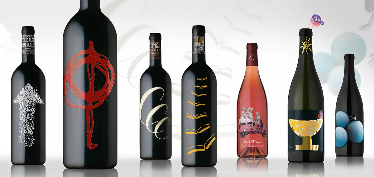
The latter has been developed in relation to a very incisive and modern strategy: each of the company's wines has been given a dedicated, non-repetitive and very distinctive design, in order to make the identity of each product unmistakable and recognisable from the very first glance, but capable of ensuring a strong sense of belonging (family feeling) and traceability to the brand.
Each project tells its own story, designed to trigger a dialogue with the observer and the attentive wine lover, who no longer sees wine as a simple food, but as a vehicle for culture and emotions.
The first step in creating Cascina Castlèt's visual identity was the design of the company logo.
Giacomo Bersanetti
The Cascina Castlet logo is the result of the union of the initials of the name and that of the town (Costigliole) where the winery is based; affiliation to the wine world, as well as the characteristic of using only its own grapes, is conveyed via the stylisation of the three initials in the form of a vine tendril.
Values such as authenticity and simplicity, craftsmanship and passion are concentrated in a sign that is current and communicative, even all these years after it was designed.
